A few weeks back, Flickr rolled out its new features specifically for the photo page. After exploring these updates for a solid two weeks, I have to say that I’m in love with them. These new updates are long overdue and make Flickr an even more user-friendly site to share and discover photos.
1.) Bigger is better
In the case of default photo previews, sometimes bigger is better. Flickr has increased the default size from 500 pixels to 640 pixels. Trust me, the extra 140 pixels do make a difference!
2.) Keeping it simple
The old menu was just messy and distracting.

The new drop down menu is much more compact and stylish. There’s also a quick navigation toolbar on the top right.

If you’re browsing another user’s photos, the favorite button is much more obvious and accessible.
3.) Looks better on black
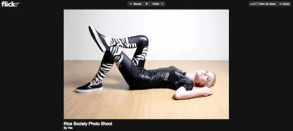
No longer do you need a third-party application to have your photo displayed on a black background. Simply click the magnify glass:
And voila! You can even start a slideshow to save you the effort of having to click the next button.
4.) Less clutter
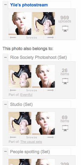
No longer would you get lost in the bunch of information and clutter on the right hand side. Everything is now compact and finally the browse slide shows more than just two photos!
Before:
After:
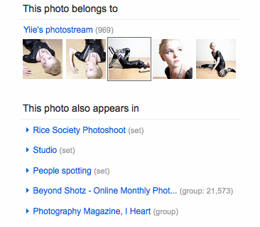
The toolbar also has a more horizontal feel than a vertical, meaning less scrolling and making browsing much more pleasant.
5.) The small, but important information
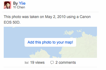
How many of you know about the Additional Information section? And if you have actually bothered to scroll down to find it, do you have a tough time processing the information?
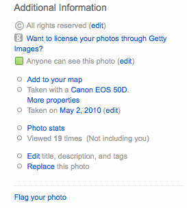
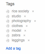
With the new Flickr layout, there’s a focus on stuff like the camera used, stats and (especially) geo-tagging. These information are now more prominent being displayed on top.
So, what are your thoughts on the new Flickr photo page layout? Love it? Hate it? Anything else you wish to share?
Do you have an awesome Flickr photo you’d like to use to create modern gallery quality wall art? Check out the photo mounting pros over at Bumblejax.com.


